Data Visualization With Python
2. Matplotlib and Line Charts
In this course, we will be using Matplotlib to visualize data in Python. Matplotlib is a Python package that is incredibly useful for generating clean and beautiful visualizations. A lot of visualizations in computer science research papers are generated using Matplotlib.
Let’s start with plotting a basic line chart.
To use Matplotlib, you will need to import the appropriate library, which can be done using the code below.
import matplotlib.pyplot as pltNow that we have imported the library, we can use the built-in functions of Matplotlib.
The plot() function in Matplotlib plots the relationship between 2 variables.
The function takes parameters for the x-values and the y-values.
Below is an example of how to generate a line chart using the plot() function. Note that to show the plot, we need to use the show() function.
To add markers to each point, add the marker parameter to the plot() function.
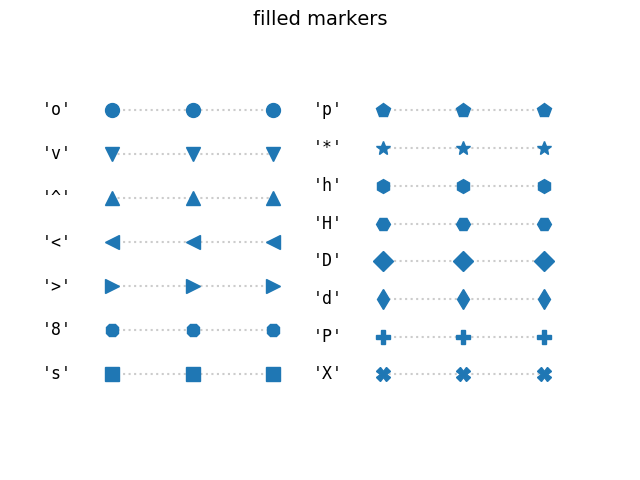
Here are the different marker codes you can use to change the shapes.
If you want to change the size of the marker, just add the ms parameter to the plot() function, as seen below. The same can be done with the edge and interior color of the markers, by adding marker edge color (mec) and marker face color (mfc).
What if you wanted a dotted or dashed line? Again, just adding the linestyle (ls) parameter to the plot() function and specifying “dotted”, “dashed”, or “dashdot” will change the style of the line. Line color can be changed by adding a color parameter. Line width can be changed by using the linewidth (lw) parameter.
What if you wanted to plot 2 or more lines? Just add another plot() function below the first one to plot a second line.
Below is a table of all the parameters described in this article.
| Parameter | Purpose | Example |
|---|---|---|
| marker | Change marker shape | marker = 'o' |
| marker size (ms) | Change marker size | ms = 20 |
| marker edge color (mec) | Change marker edge color | mec = 'red' |
| marker face color (mfc) | Change marker face color | mfc = 'blue' |
| linestyle (ls) | Change style of line | ls = 'dashed' |
| linecolor (color) | Change color of line | color = 'green' |
| linewidth (lw) | Change width of line | lw = 10 |
The next lesson will focus on adding labels and other features to a plot.